
PlayStation Accessibility Plug-in
Mobile & Web Design Library lacks documentation and parity with the GitHub Storybook.
The Problem
The Mobile & Web Design Library lacked documentation and parity with the GitHub Storybook.
UX Designers and Engineers wasted time cross-referencing libraries, leading to inefficiencies.
User sentiment
Quote Source
“Mobile/Web seems out of date/inconsistent with what's in production, missing a lot of components, and requires lots of cross-referencing with documentation and screenshots.”
Quote Source
“It’s not clear what components are for web and what are for mobile. The developers are using other components, and the final product is unlike the original design.”
Process & Solution
Work we did
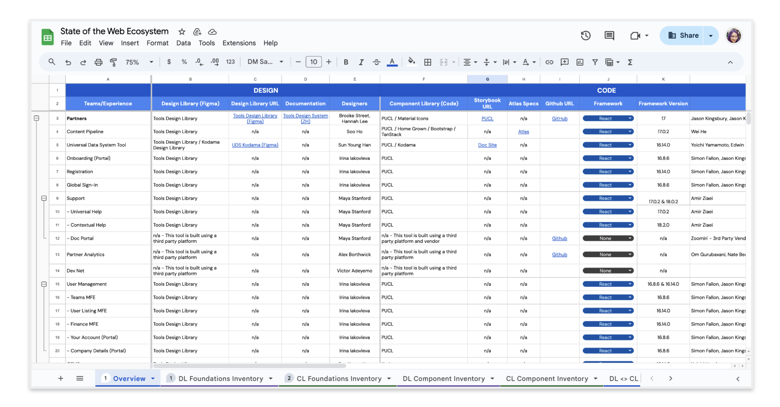
🔎 Phase 1: Audit & Inventory
Conducted a full audit of the Mobile & Web Design Library.
Created an inventory of all web interfaces & libraries.
Analyzed inconsistencies and gaps.
What was found
📌Phase 2: Identifying Key Issues
60% lack of parity within web components.
~330 hours wasted customizing components in the code.
Mobile & Web components were mixed in Figma, while GitHub libraries were independent.
How we solve it
✅Phase 3: Implementation & Standardization
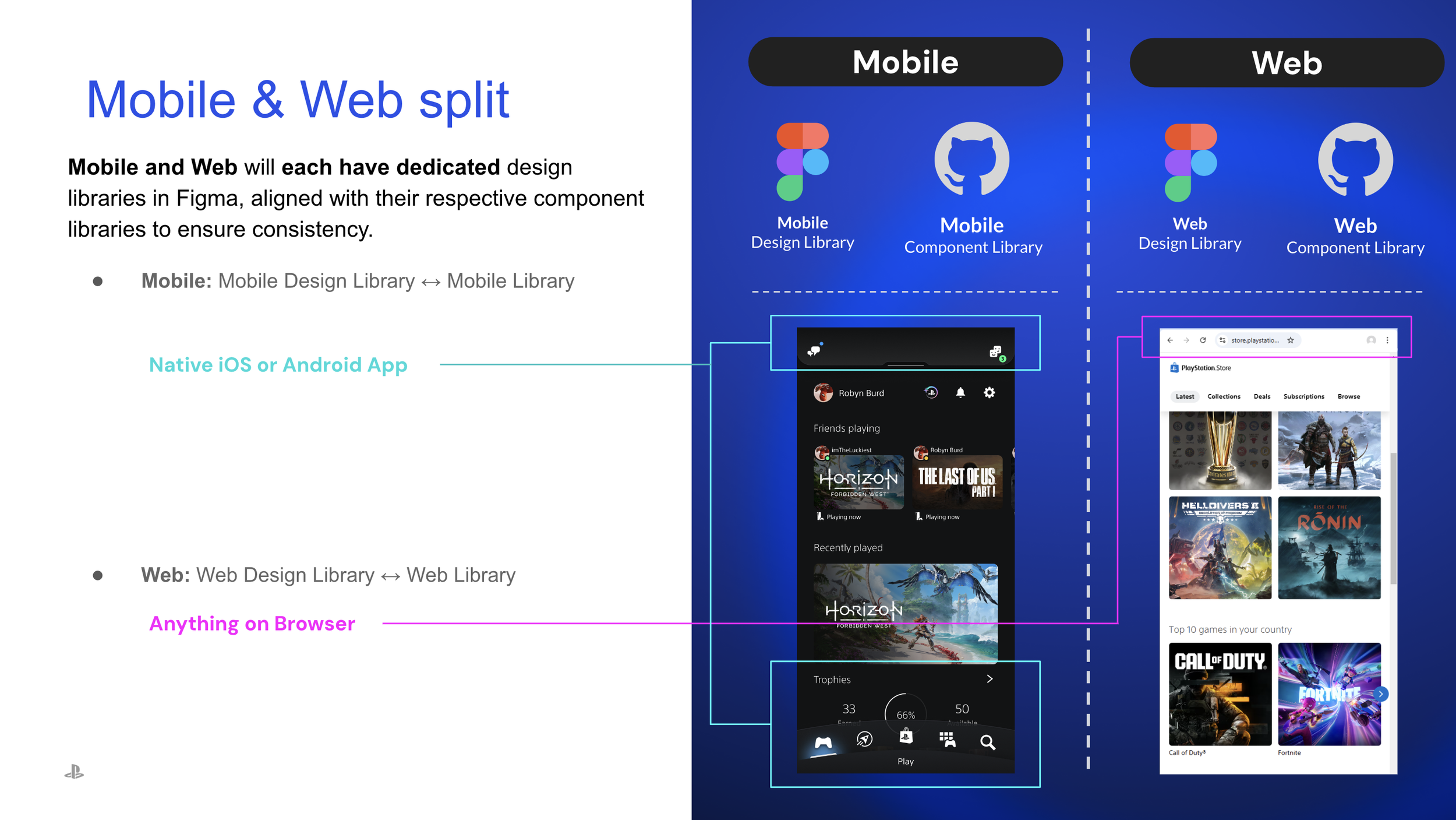
Built a Web-only Design Library in Figma for clearer separation.
Aligned nomenclature and properties with each GitHub Library.
Introduced design tokens for scalable updates and consistency.
Let’s take a look
-
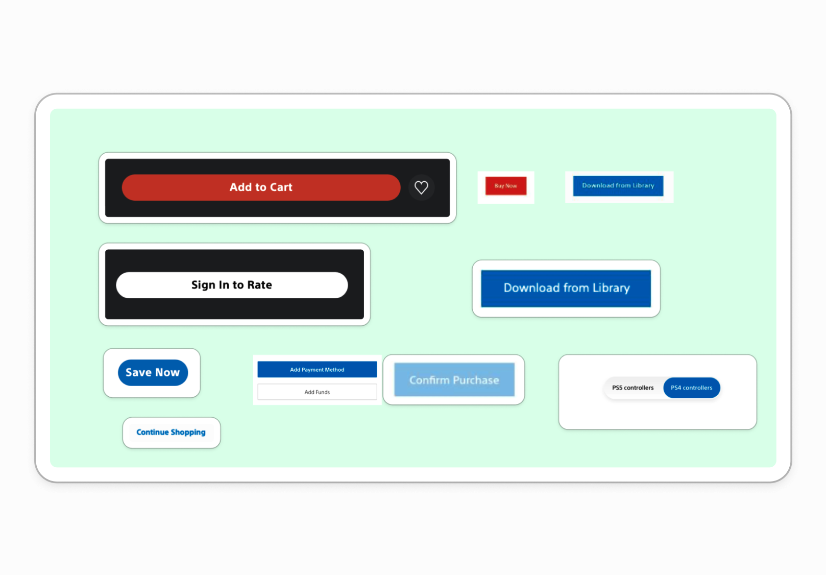
![Web-only Component.]()
Web-only Component.
- The original mobile/web library didn’t support hover and error states.
- Followed properties as are written in the GitHub Web Library. We now support all states. -
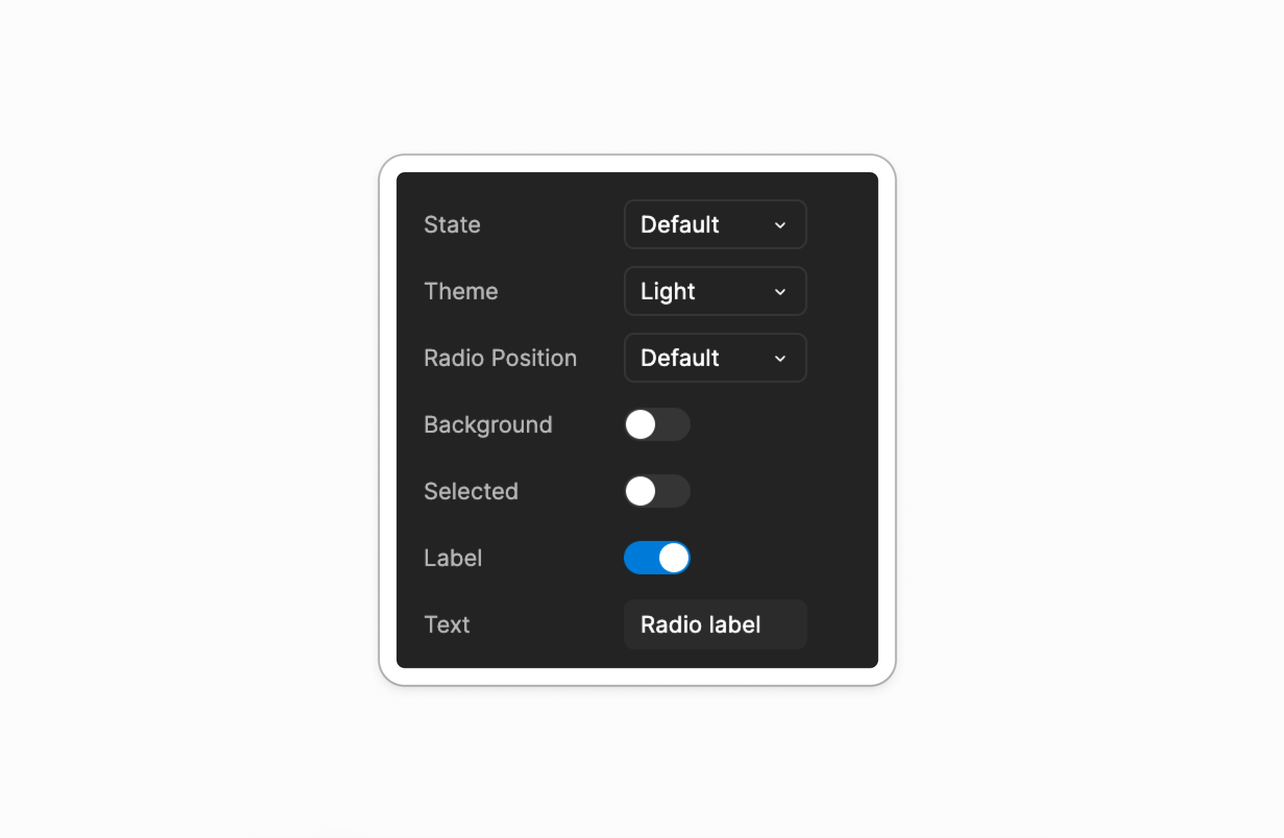
![]()
Clean Variants.
- The original mobile/web library was messy because the team migrated all components from Sketch Symbols.
- These new components are made in Figma and optimized using nested variants and toggles.
-
![]()
Description.
- We lacked context or resources about the components in any library.
-This initiative was approved and added to other libraries like PC and PS5. -
![]()
Organized File.
- The original mobile/web library had all components in one Figma Page, but designers often complained about how difficult it was to find a component that way.
- Created a component per page. -
![]()
Tokens.
Impact:
- 🫱🏼🫲🏽 Enhanced teamwork between design and engineering
- 👁️ Boosted accessibility
- 👩🏻💻 Decreased technical debt
-
![]()
Responsive breakpoints.
Optimized breakpoints for web 🖥️💻📱 (desktop, laptop, tablet, and mobile – including our grids!)


Documentation
📖 Phase 4: Documentation & Guidelines
Created dedicated documentation for each platform, including:
Clear property & token explanations.
Component usage guidelines with Do’s & Don’ts.
Image examples for clarity.
Accessibility constraints & WCAG 3.0 rules.
🚀 Impact & Results 🚀
📊 Efficiency Gains
Reduced cross-referencing time for designers & engineers.
Improved component adoption rates in Figma.
🤝 Stronger Collaboration
Worked closely with engineers, PMs, POs, and designers to align needs.
Standardized communication between UX & development teams.
💡 Lessons & Next Steps
Implementing continuous tracking of component adoption.
Expanding documentation to cover edge cases & custom implementations.
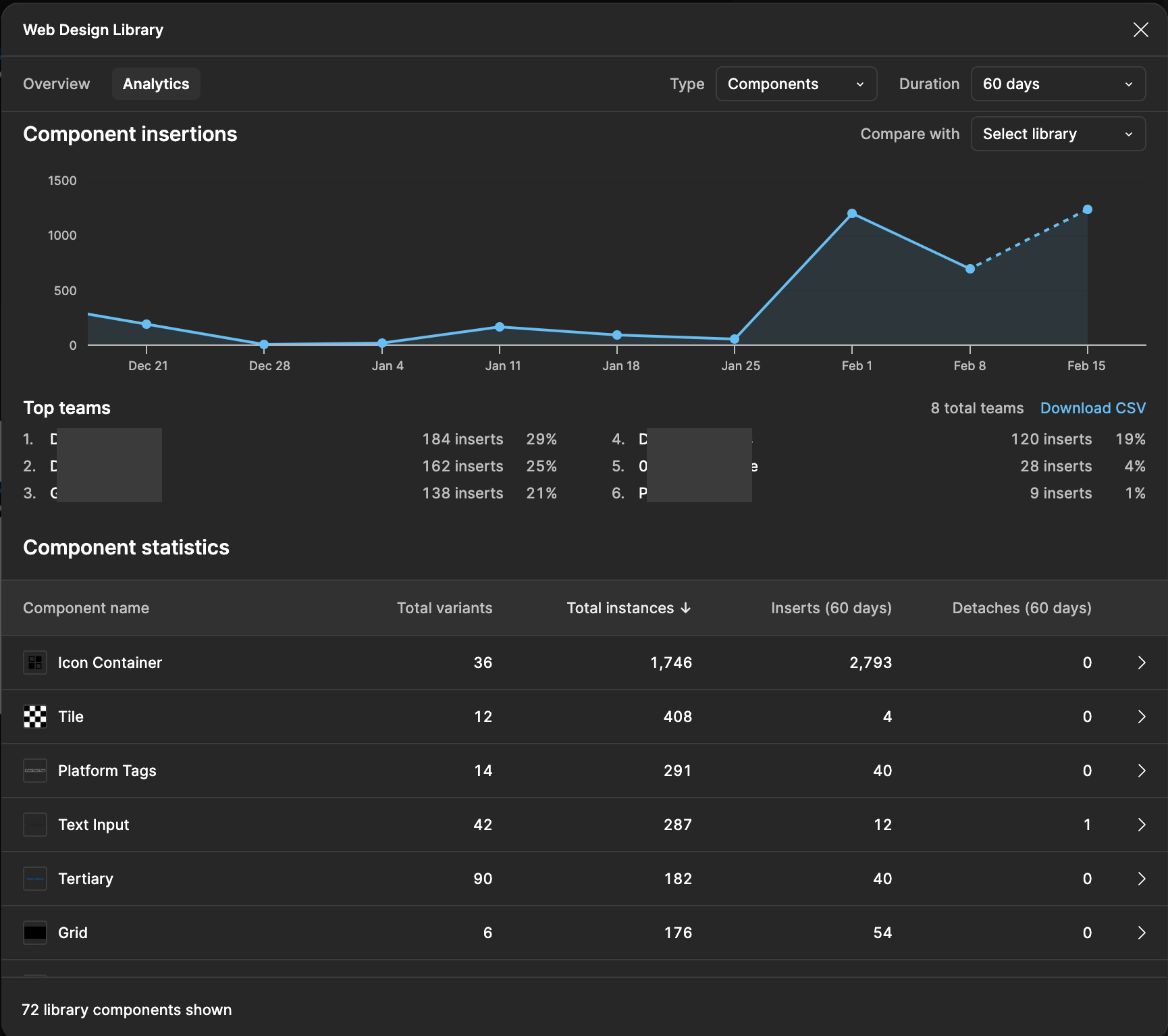
Figma statistics after 60 days of adoption